BackLocal Startup Company
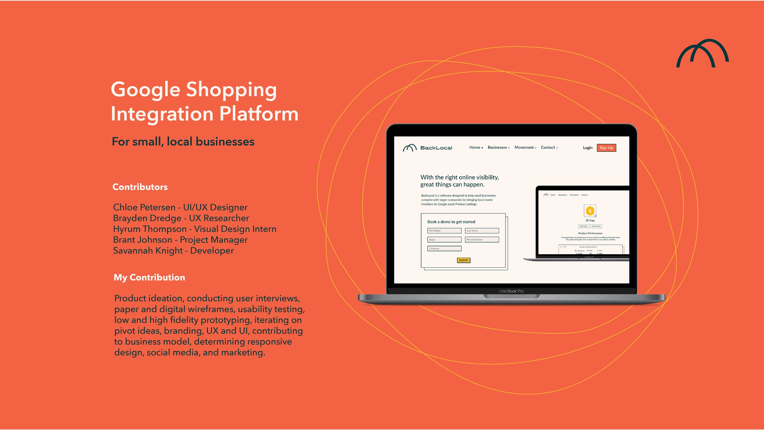
BackLocal is a software company aimed at empowering small businesses to compete with larger corporations by integrating local store inventories into Google Local Product Listings. As a co-founder and CXO, I led branding, product design, and marketing efforts for the company. My responsibilities included designing the website, creating business pitch decks, presenting to angel investors, and participating in high-level business discussions and decisions.
Working in a startup environment enhanced my ability to rapidly prototype and test business concepts with real users. The following case study showcases our journey from ideation to sketch, wireframe, and ultimately to the prototypes we tested.
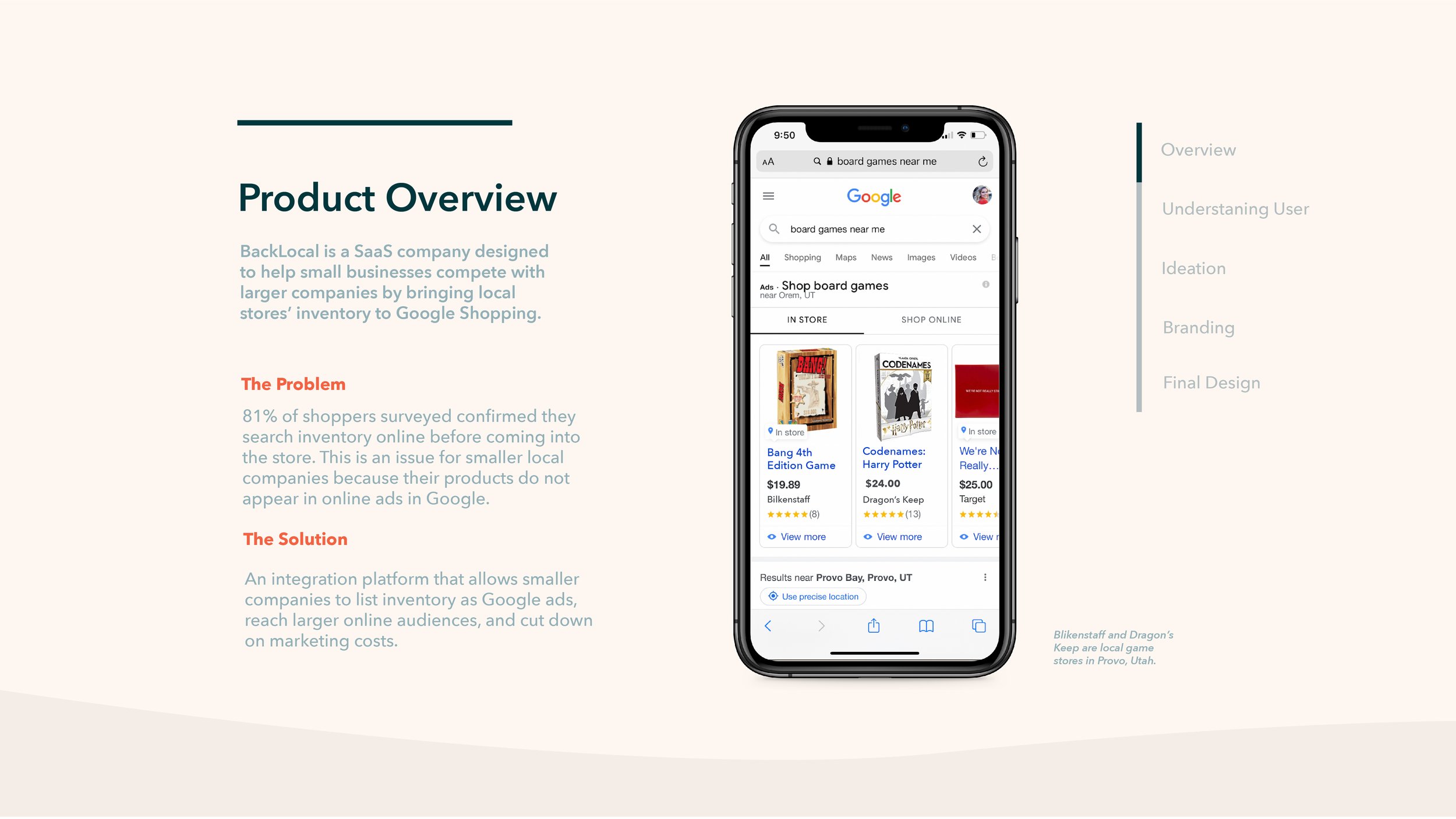
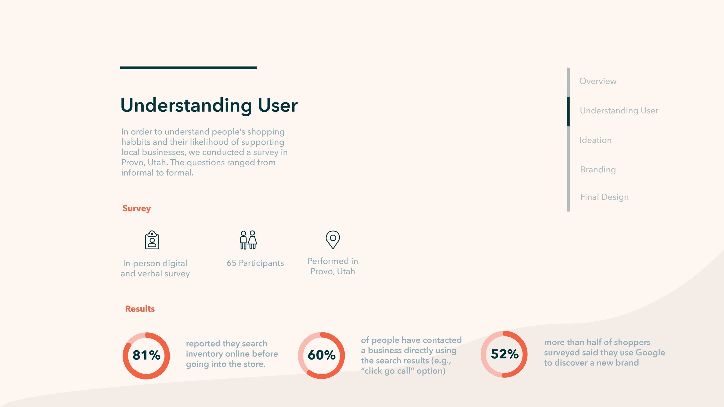

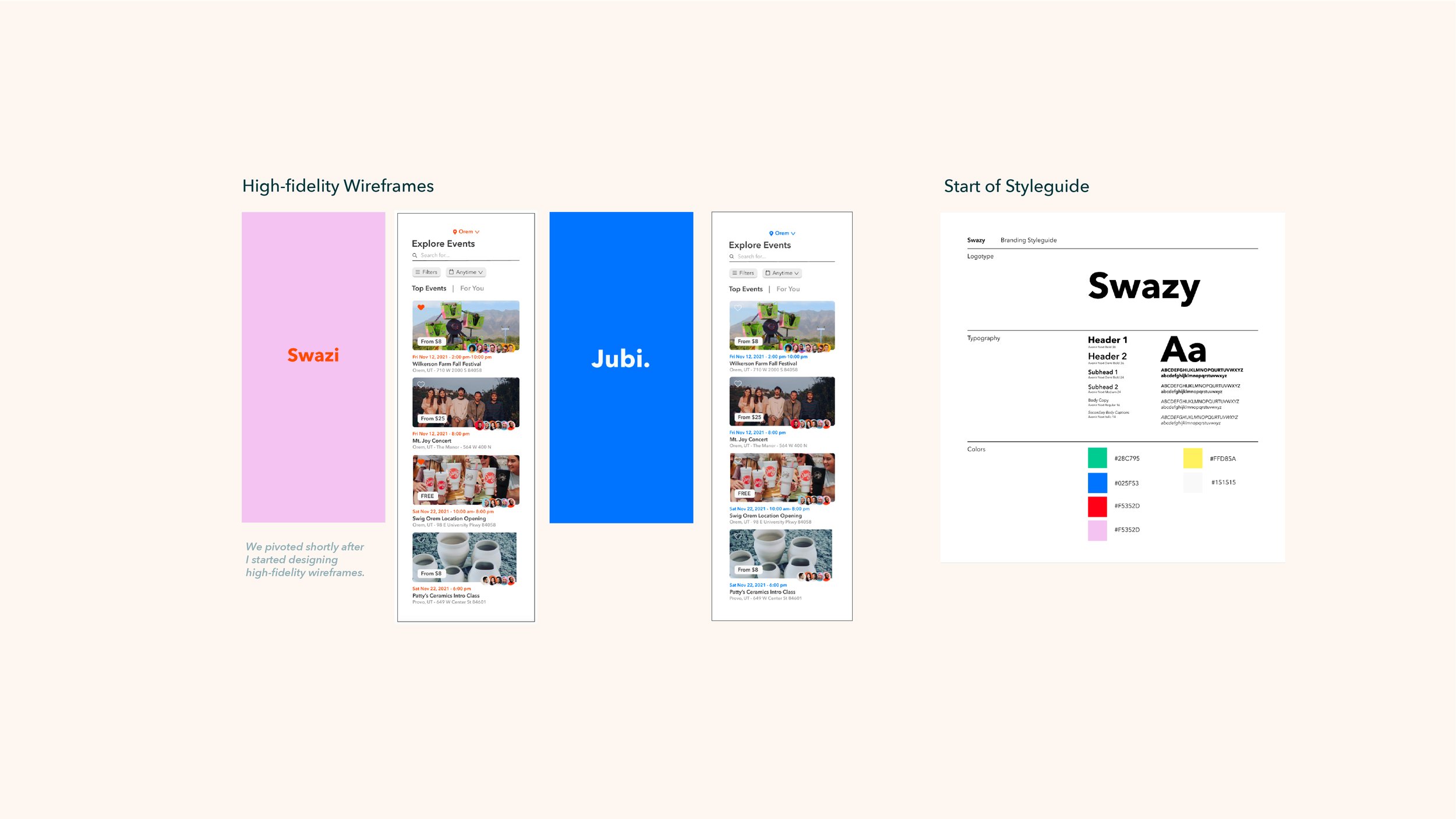
We decided to pivot after validating this first business idea. Through research, we learned that people would be more likely to use a new app to find local products, not local events and that people we surveyed were not willing to pay for this service. These findings led to our pivot to our next business idea.
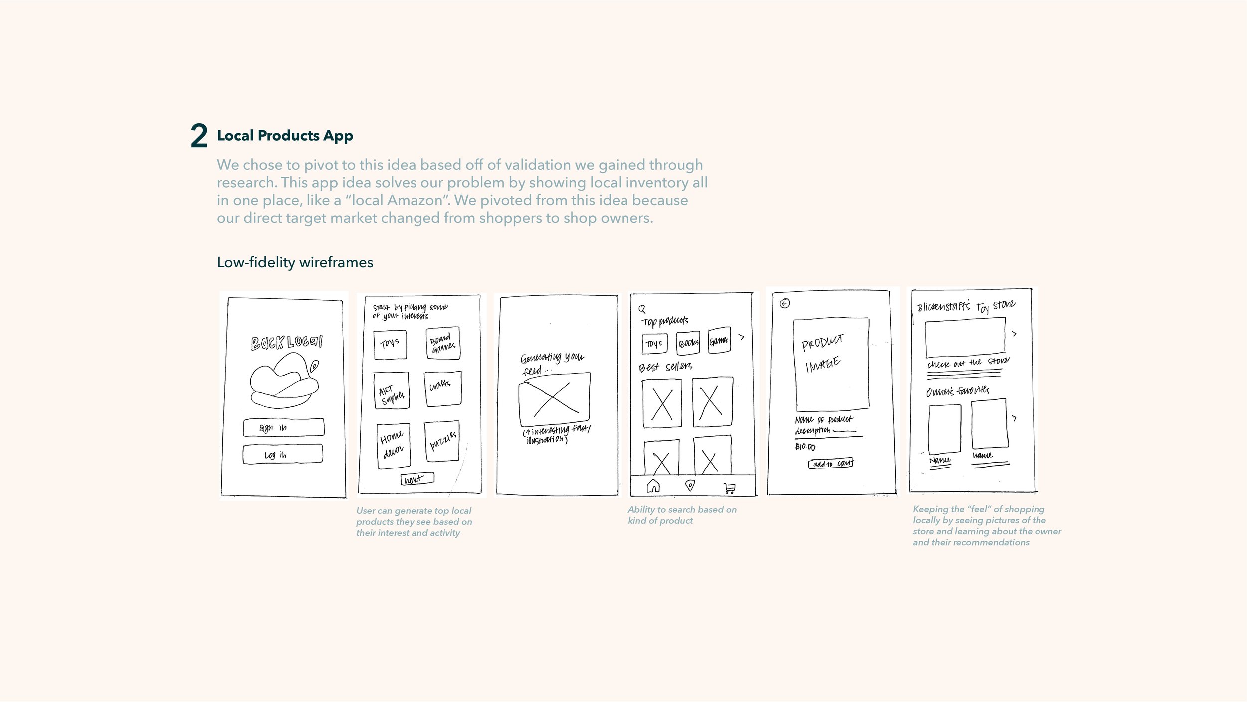
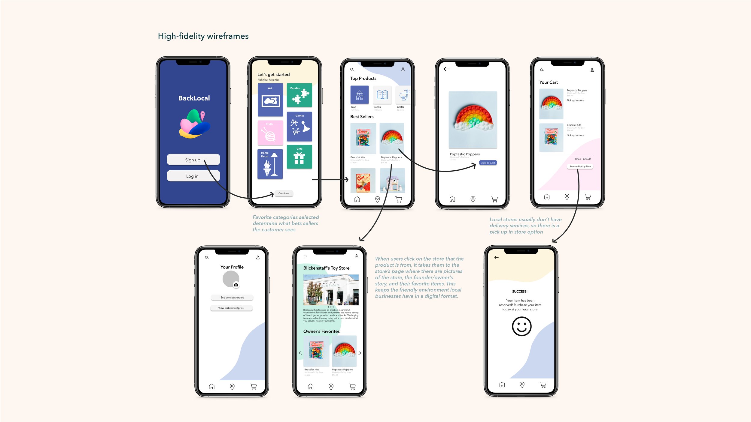
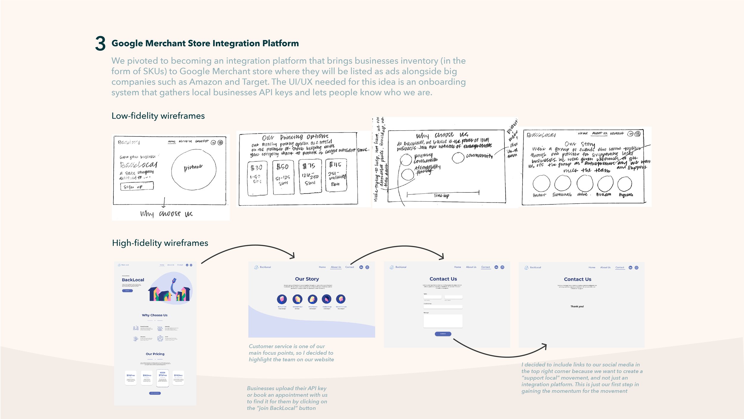
When we tested this prototype, we received feedback that people would be less likely to use the app after initially downloading it and that some local business owners were skeptical about the legitimacy of sales from the app. Local business owners wanted a more direct way to reach customers that linked to their company websites. We listened to this feedback and formed our final business idea, a SaaS product that linked local shop owners' POS systems with Google Local Product Listings to increase their online presence.
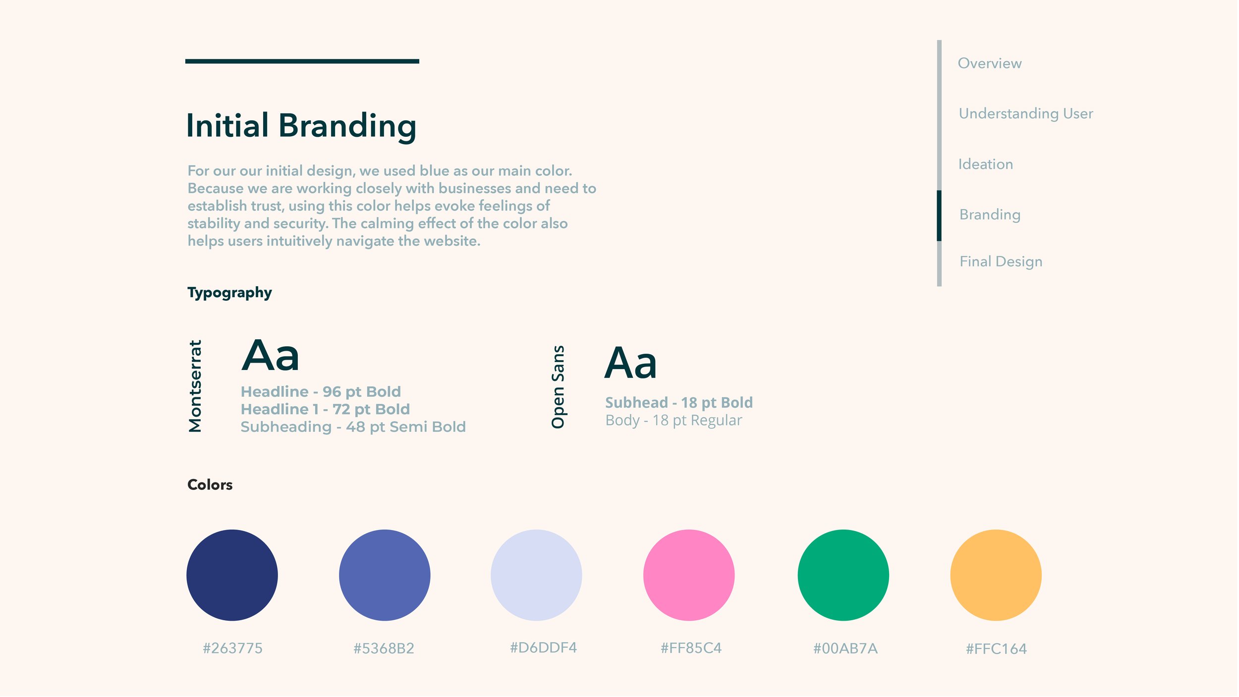
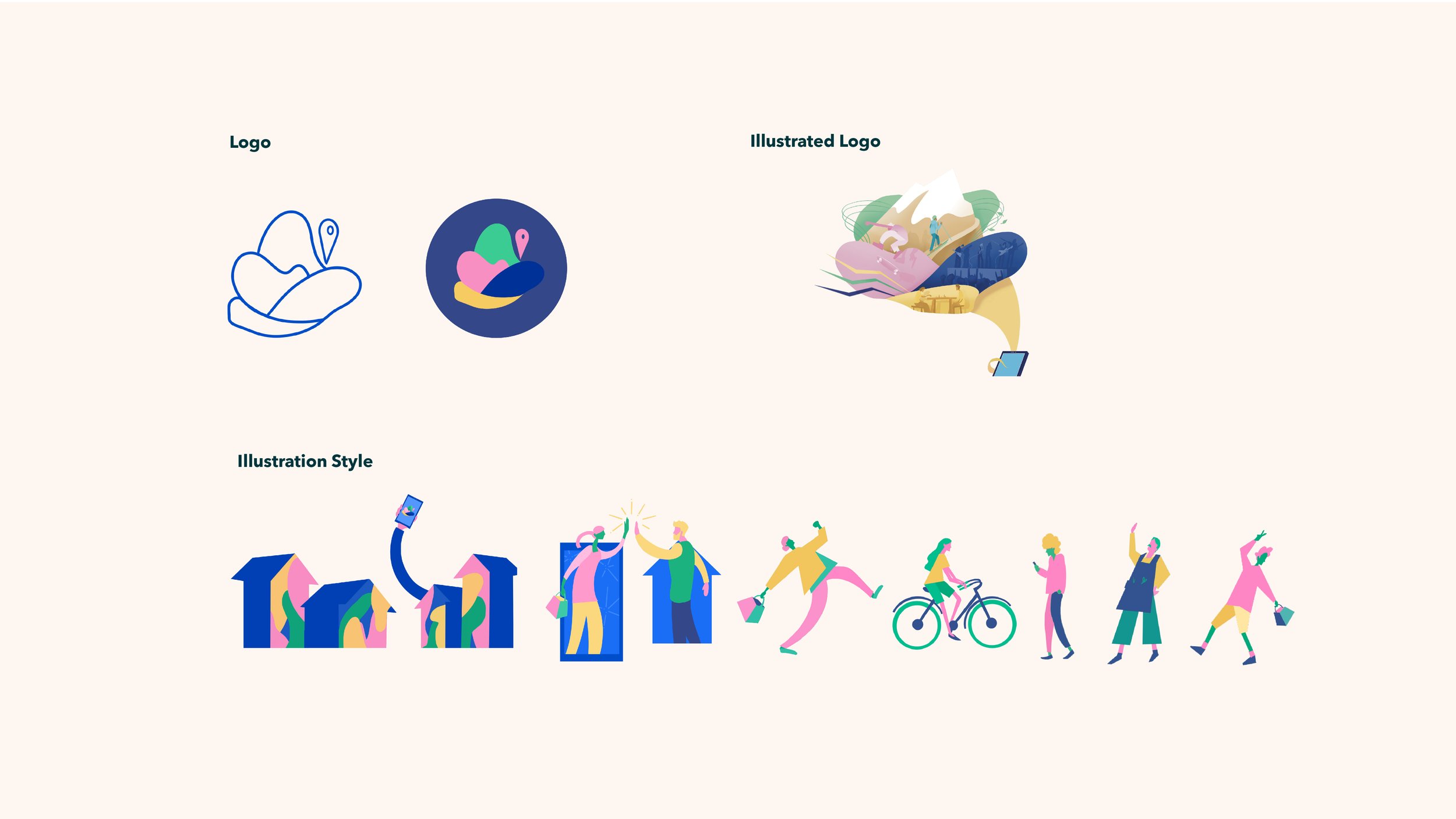
This branding was created when BackLocal's business plan was an app that listed local events for people to go to. The organic shapes in the logo represent the different kind of events people can go to, for example, outdoor venues or concerts. In the illustrated logo, these different kinds of events are detailed. Since our business idea pivoted and our customer segment group changed from locals to local business owners, we decided to re-brand. Our goal was to maintain a retro eighties feel while still showing professionalism.
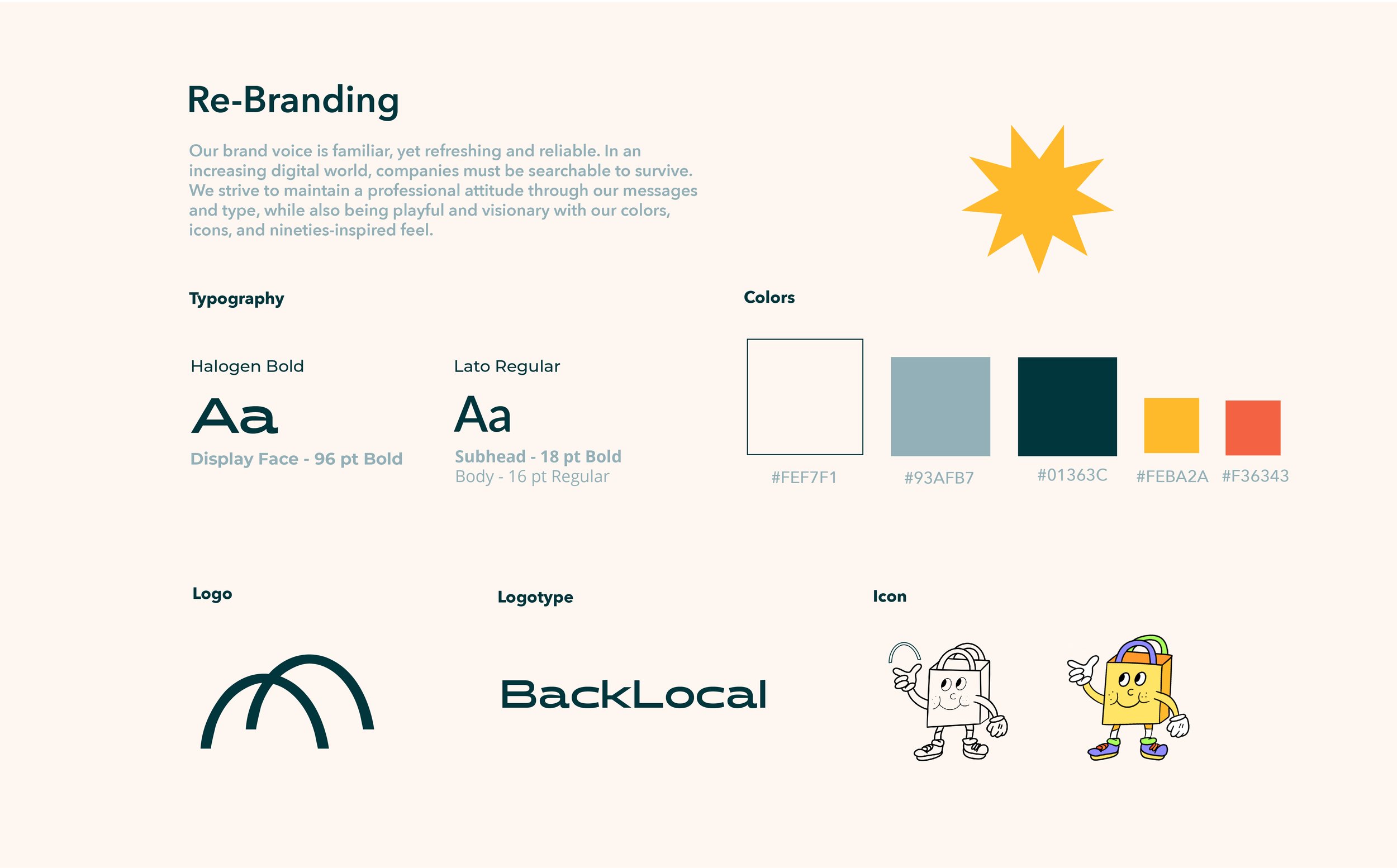
For our re-branding, I decided to create a logo that represented the bridge that our SaaS company created between local shop owners and local business owners. The conceptual bridge in our logo also creates the handles of a shopping bag. This "shopping bag" icon element of our branding was used on stickers and other marketing and social media campaigns. I chose colors and typography that have a retro eighties feel, but still maintain professionalism. The retro style is meant to be reminiscent of a time when people came together as communities to support their local shop owners, which is the main focus of our company. The goal of our branding was to amplify our business, but also to stand at the forefront of the new wave of the shop local movement.
BackLocal Video Walkthrough
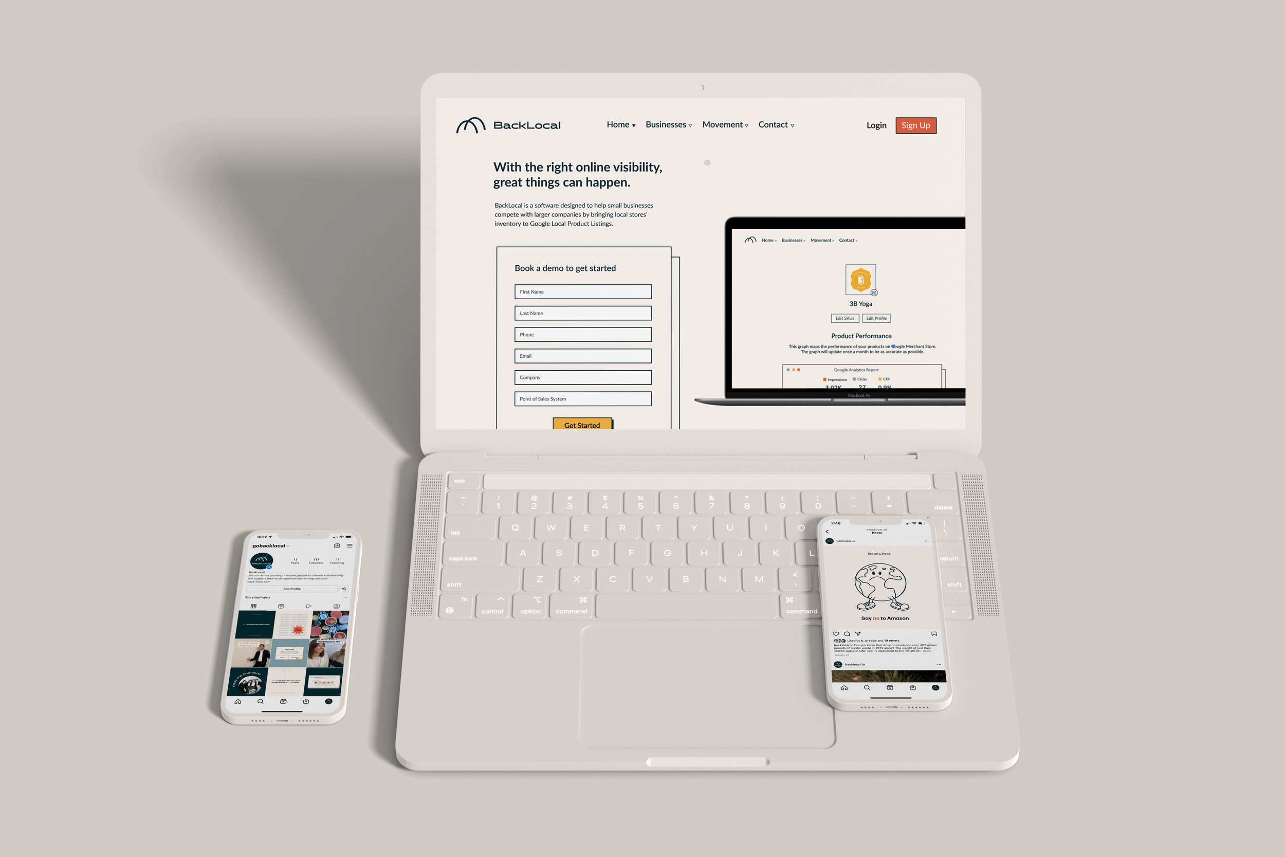
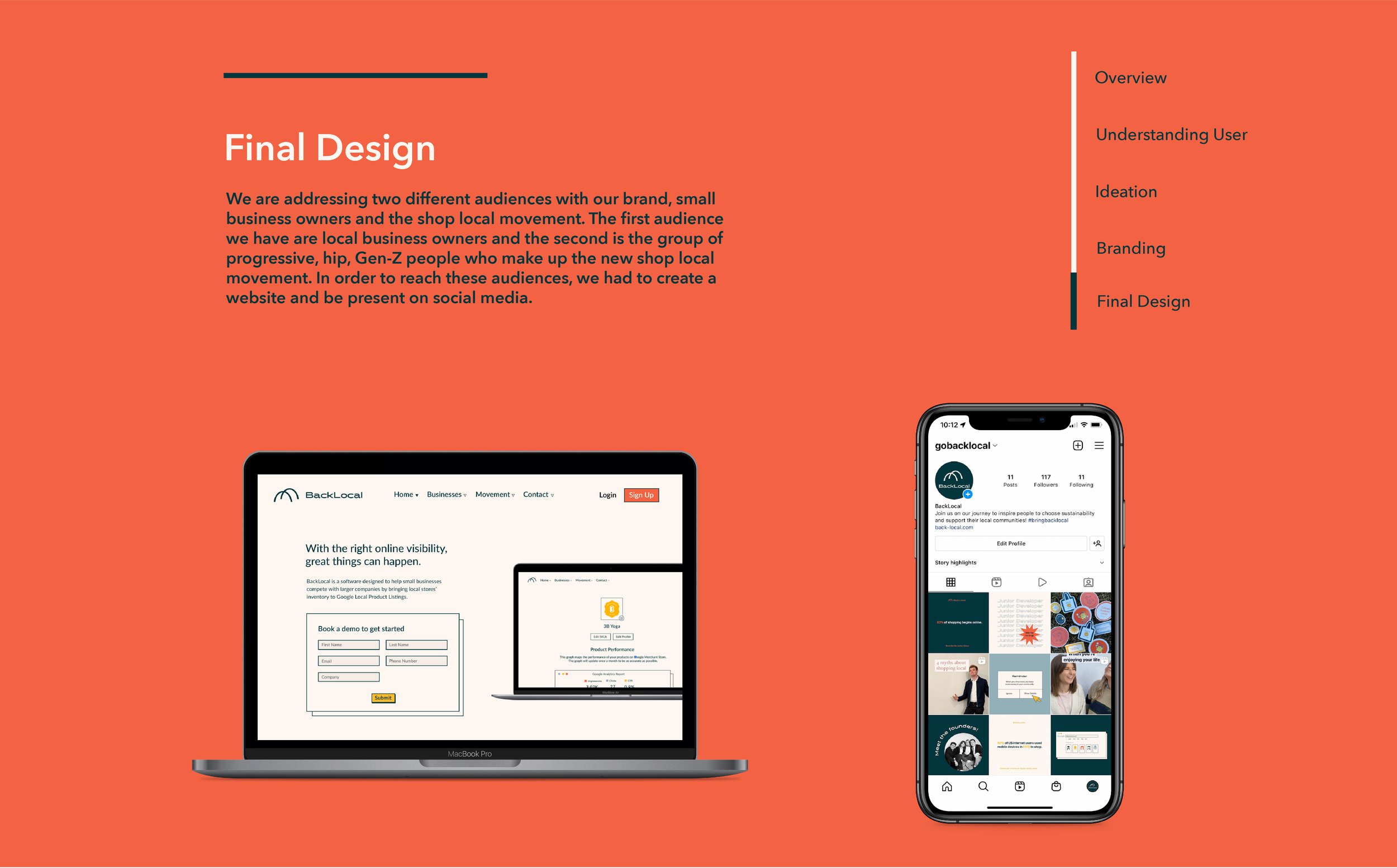
Our desktop landing page is vital to the company because it is what connects the local store owner’s inventory to Google Local Product listings.


